Transitional Faces
 Transitional Faces: The Lives & Work of Richard Austin, type-cutter, and Richard Turner Austin, wood-engraver.
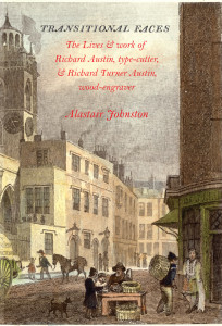
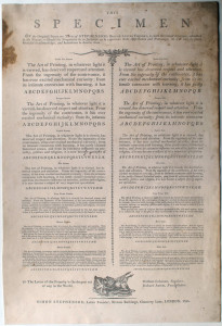
By Alastair M. Johnston, 2013, 400 pages, cloth in dustjacket. With hundreds of illustrations, type specimens, and many useful appendices, including an Austin family tree, conspectus of all Austin’s types, Austin’s engraved letters, ephemera, and a map of Austin’s London. $125. The first 300 copies include a facsimile of the Stephenson broadside specimen of 1790 shown above (printed in duotone by Clifton Meador).
Long thought to be one person, Richard Austin turns out to be a father and son who shared the same name. Although Austin’s importance to the history of typography was never in question, his (or rather their) dates and final resting place were forgotten. After a decade of research, Alastair Johnston has written a biography of the Austin family in which he assesses their contributions to the development of book design and typography at a crucial time in British publishing history. Richard Austin (1756-1832) took the innovations of John Baskerville and, through the sharpness and delicacy of his type cutting, perfected the typefaces of the period between the Old Face of Caslon and the Modern faces of the Didots and Bodoni, an era described as ‘Transitional’ by Updike, which saw the first flowering of the British fine press. In his later work, Austin pulled back from the impractical hair-lines of the Modern style to a workable type now known as Scotch Roman which became the workhorse of many sensible printers in Britain and North America.
 This book includes the complete 24-page 1827 Imperial foundry specimen; pages from an unrecorded specimen book of George Cawthorn; a Fry & Steele broadside of display types; samples of the Porson and Sarcophagus greek types, Austin’s ‘Scotch’ types and more.
Austin’s son and namesake Richard Turner Austin (1781-1842) was a commercial wood engraver, producing blocks for scores of works in the first three decades of the nineteenth century. He was not a Bewick pupil but did learn by copying the work of John & Thomas Bewick, working alongside his father in Paul’s Alley, St Giles Cripplegate, London (that’s St Giles at left, on the cover). He also exhibited paintings at the Royal Academy. In 1819, Austin Jr relocated to Edinburgh and began illustrating children’s books for the house of Oliver & Boyd.
Johnston documents 130 works illustrated by Austin, with complete bibliographical details, known variants, illustrations of title-pages, and many of Austin’s over 1000 known engravings. Along the way, Johnston introduces the reader to some fascinating forgotten authors, bringing to life the world of Macklin, an Irish actor who stabbed another thespian in an argument over a wig in the green room at Drury Lane, and Captain Pasley, a Scottish soldier with a romantic heart who was a friend of Coleridge and the Wordsworths.
Johnston uses his knowledge of printing and publishing history, as well as his wide reading, to evoke this era of revolutionary change in the world of printing, during which Britain not only emerged as a major publishing centre, but also became a world power.
Reviews are coming in for Transitional Faces:
Nicolas Barker, editor of The Book Collector (London, Autumn 2014, pp. 495-7), writes:
“Alastair Johnston’s latest foray into typographic history is as richly rewarding as his earlier Alphabets to Order.
“The desire for typographic change in the eighteenth century goes back to Baskerville, but other provincial printers, Davison in Alnwick, Etherington in York, Eyres in Warrington, were restless and change was in the air. When John Bell returned from Paris in 1788, anxious to set up a printing house that would emulate the Didots’, he found a punch-cutter nearer at hand, in St Giles’s, Cripplegate. This was Richard Austin (1756-1832), who cut for him the new types he wanted, an Anglo-French marriage aptly characterised by Johnston as having ‘the larger-on-the-body proportions of the romain du roi with the modelling of Baskerville but with more colour and fine serifs’. These types survived the demise of Bell’s British Letter Foundry, passing to S. & C. Stephenson. Johnston makes a good case to suppose that Austin also cut types for Fry and Vincent Figgins, but his next original work was the cutting of the ‘Porson Greek’ for the Cambridge University Press in 1806-8, which was to have a lasting influence on Greek typography. Less well known, but even more influential was his work for the two great Scots founders, Alexander Wilson in Glasgow and Wilson’s foreman William Miller, who migrated to Edinburgh in 1807. The specimens issued by both founders in 1812 and 1813 show a range of types demonstrably different, but too like to be by any other hand.
“… It is perhaps the largest of the merits of this admirable book to have reconstructed the oeuvre of both Austins, and in particular Richard Turner Austin. His long connection with the artist William Marshall Craig is given due coverage, but his own talents as an original designer are even more striking. Johnston’s careful list of works signed or attributable runs to 200 pages, not definitive, he admits, but enough to give a fair picture of what must be the largest body of such work, more than Nesbit, Thompson or any of Austin’s other contemporaries. Besides this, there is a lively account of their lives and time, based on archival as well as printed sources, and full of wide-ranging social comment. When the history of the woodcut in England comes to be extended beyond 1603, the current limit of Hodnet and Luborsky and Ingram, this will be a book to put on the shelf beside Tattersfield’s monumental Bewick. The part devoted to Austin’s types adds a new chapter to the history of British typography.”
Crispin Elsted, writing in Parenthesis, Journal of the Fine Press Book Association, Autumn 2014, pp. 44-6, writes:
“Richard Austin (1756-1832) and his son Richard Turner Austin (1781-1842) were central figures in the development of these types, and Alastair Johnston, in Transitional Faces, seems surely to have unearthed all these is to be discovered about them. Beginning with what little information about Richard Austin père has incidentally attached itself to the typographical history of Scotch Roman, Bell, and Porson Greek (the three most important faces designed by him), Johnston has pored through parish registers, type specimen books, publishing histories, and the city records of late 18th and early 19th century London, together with many other sources, to uncover the working lives and origins of this family. So veiled is the history of these two men that even Stanley Morison assumed them to be one person — a misunderstanding exacerbated by their both habitually signing their engravings simply as ‘Austin.’ Indeed so widely has Johnston cast his net in search of the Austins that he even details two Austin families bearing the same Christian names who are no relation to the family under discussion.
“Johnston’s book is a treasury of information about the Austins and the world in which they worked, especially regarding the trades of punchcutting and type founding at the time. He is precise and eloquent on the shaping of letters and the distinctions between the transitional faces and the modern faces which began to replace them in the early 19th century. … The nuggets of information which sift up in the course of the book are as fascinating as the main subjects themselves. … All of us who are interested in bridging the the unavoidable gaps in our knowledge of the early approaches to typography in the last two centuries owe Alastair Johnston a considerable vote of thanks.”
Rich Hopkins, writing in ATF Newsletter no 40, March 2015, says:
“By challenging respected authors, Johnston absolutely had to present his information with meticulous documentation. He has done it in an absolutely scholarly, thorough and convincing manner. The book is a ‘must-read’ for anyone who ever has sought clarity and understanding of the typographic scene in England in the late 1700s. The book also includes numerous excellent reproductions of specimens and ephemera relevant to the text. All future writers must access this book if they are to make a valid assessment of early developments in typography in England — and the rest of the world.”